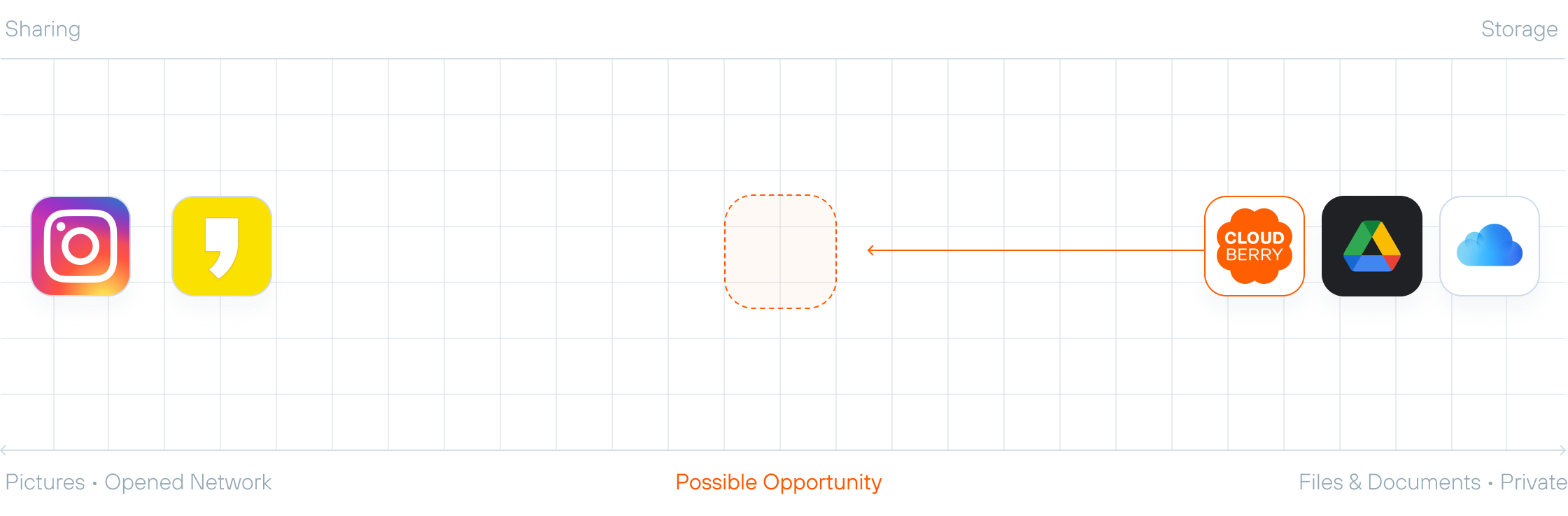
Cloudberry began as a mobile cloud, but were trying to evolve beyond a mere file storage and deliver new value for users as a space for memories and sharing with their loved ones. To support this shift, I proposed a design renewal that introduced a more friendly brand identity, improved file navigation usability, and enhanced content discovery experience.
SK Telecom is the leading mobile carrier in South Korea, providing a wide range of digital services and platforms. CloudBerry originated from SK Telecom’s early cloud service, T Cloud, and evolved into a mobile-optimized personal cloud platform. Moving beyond simple file storage, the service focused on enhancing the experience of storing and managing photos and videos created on mobile devices. We aimed to reposition Cloudberry from a file storage to a platform for sharing files and photos. it focused on enabling simple and seamless sharing within private groups.
Through a half-day team ideation workshop, we aligned on the long-term vision and goals for CloudBerry. Then analyzed the existing service to identify key usability issues and defined action plans for improvement.

improvements were needed in basic file navigation and key usability pain points across the service.
We need to create contents that users would want to share, making sharing a more natural and engaging experience.
List view for quick file access and grid view for easy data exploration. In grid view, thumbnail for photos was designed to reflect the aspect ratio of each photo — square, portrait and landscape. Re-designed folder and file icons to be more visually distinct. This allowed users to more easily identify file types and quickly find the files they need.

In the existing CloudBerry experience, when navigating files, users often lost track of their current location within the folder hierarchy. I introduced a breadcrumb-style path in the top navigation bar alongside a back button, enabling users to better understand where they are and navigate more confidently.
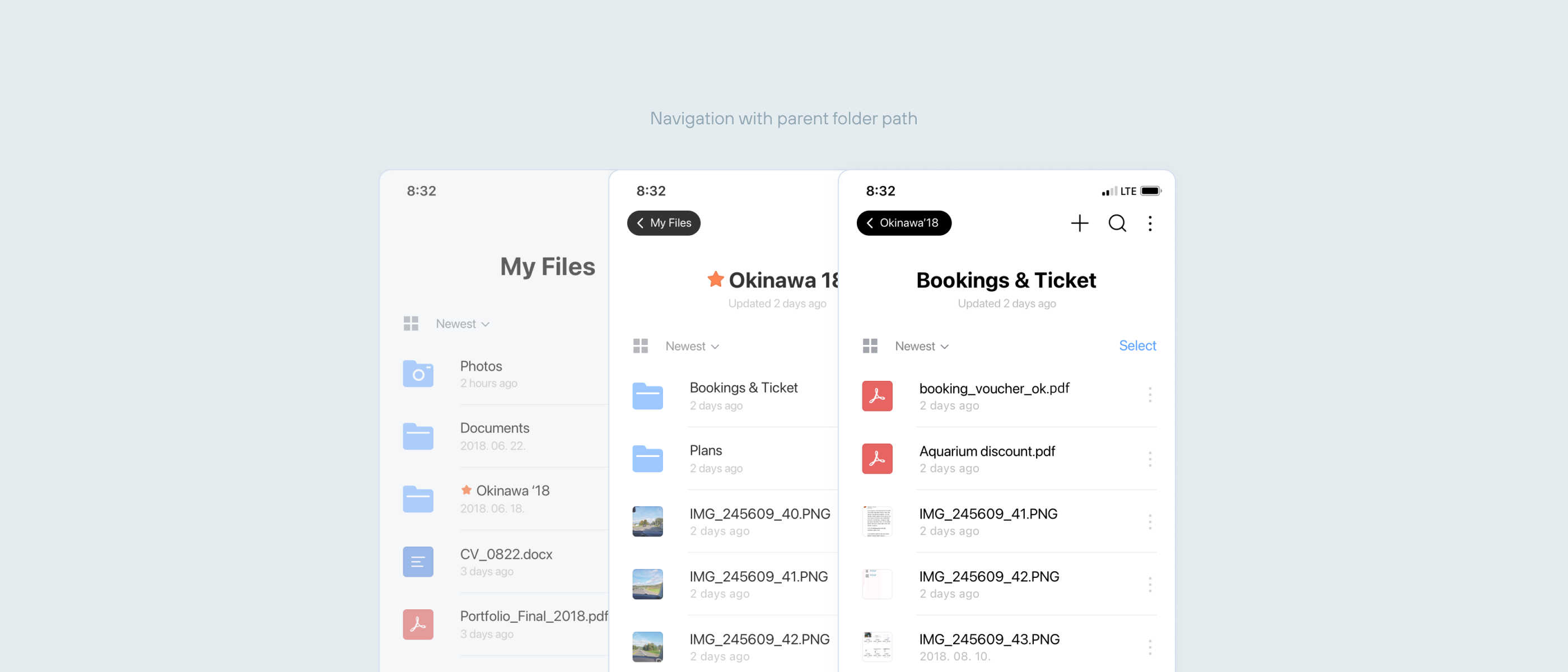
In addition, users struggled to understand where files were being moved during the file moving process. To improve this, selected items were clearly highlighted, and the destination folder was made visible directly within the action button—reducing confusion and helping users complete tasks with clarity.

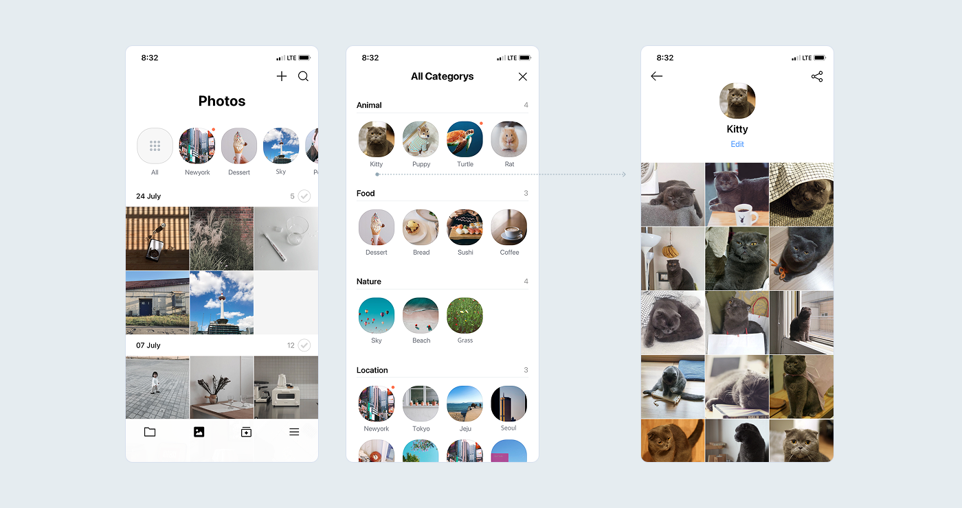
Image analysis automatically groups photos into meaningful collections. Instead of manually organizing files, users can discover their content organized by people, pet, or place — making the gallery feel personal and browsable.
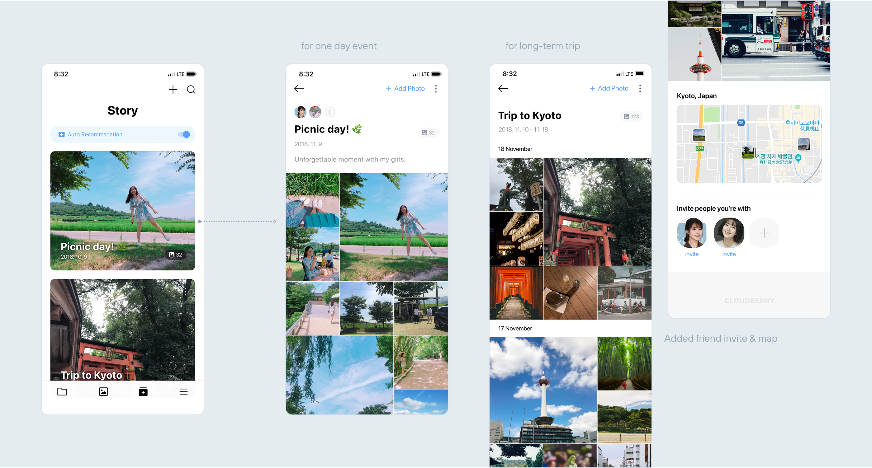
The existing Story Album was only for a single-day events. To offer more contextual content for users, I introduced templates that support both short-term moments and longer experiences. In addition, I proposed adding a friend invite feature by leveraging image recognition — originally planned for the Photo tab — and display photo locations on a map.
These enhancements aimed to create more meaningful, shareable, and memorable content for users.