
Samsung's financial affiliates launch unified service app Monimo
Monimo, Building Integrated Financial Platform for
Samsung
I joined the taskforce to build brand-new mobile app as a product designer to intergrate all scattered financial services of Samsung in order to provide more comprehensive experience in one place and create new opportunities for Samsung. I built design system from scratch with 5-interaction designer and worked with 3-project manager, 10+ engineers.
Business Background
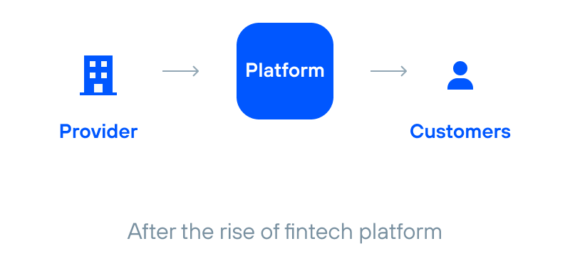
The Rise of Fintech and Changing User Expectations
Samsung operates four financial companies across all personal financial service including Insurance, credit card, investment, which have been in operation for over 70 years and are well-known for their trusted reputation in Korea. However, with the rise of fintech platforms offering convenience and appealing to younger generations, they were at risk of being perceived as mere product providers.

Problem Space
Business
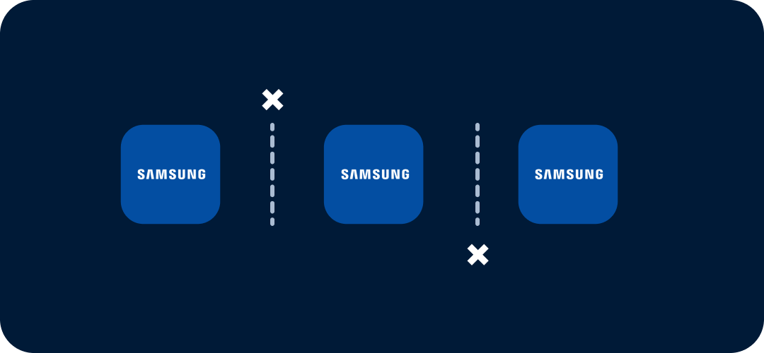
Samsung's four financial companies operated independently — no shared platform, no unified experience, no synergy between them.

Users
Finance was already hard. Samsung made it harder — complex interfaces, heavy content, and no reason to keep coming back.
Project Goal
For the business
How might we create synergy across Samsung's four financial subsidiaries through a unified platform?
For the users
How might we make finance feel relevant and engaging enough that users actually want to come back?
Research and Insights
We conducted existing service analysis and target user research to understand users and the current experience. we identified key challenges in the current financial experience.
01
Users want to decide — not be sold to
Most users didn't want to just pick from a list of recommended products. They wanted to make their own financial decision. But financial terms were confusing, and it was hard to know what they actually needed. In practice, they relied on peers or experts to make sense of it — someone to compare with, someone who'd been through it.
02
Financial things feel complex and difficult to understand
Users often pause when faced with complex financial terminology. The moment something feels difficult, they tend to abandon the app. Clear, simple language and concise insights play a key role in lowering the barrier to entry.
03
Samsung's platform felt fragmented and boring
The experience was built around what Samsung offered, not what users needed to see. No full picture, no personal relevance, no reason to come back.
Design Strategy
These insights revealed that we needed to make our platform:

Make it personal
Show users how their financial life compares — so they can see what matters to them.

Make it understandable
Translate financial complexity into language users actually speak.

Make it engaging
Give users a reason to come back. Every day, something relevant.
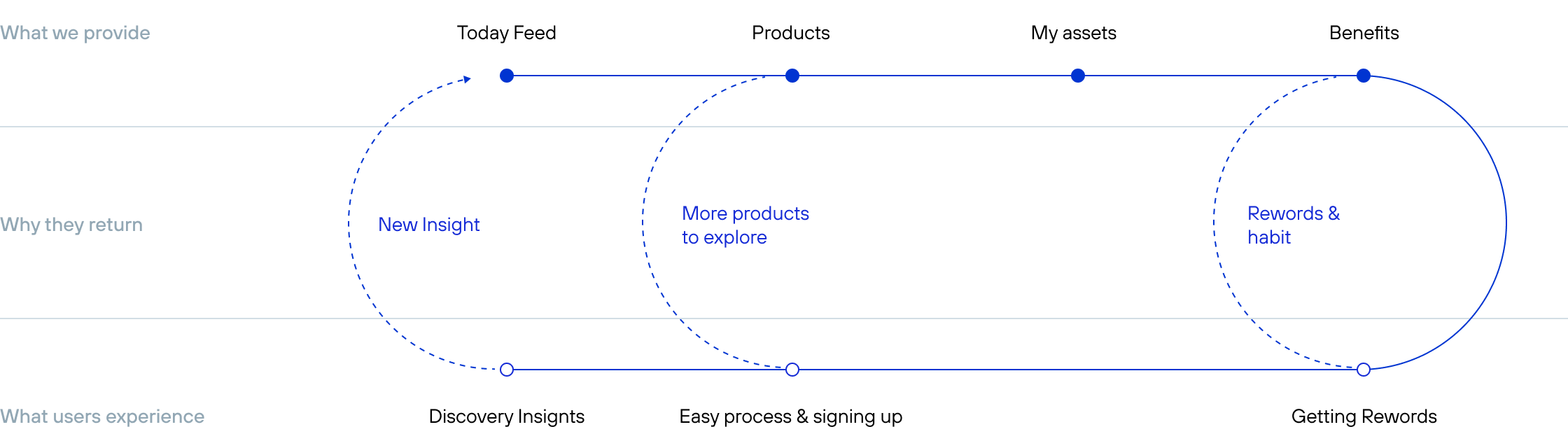
Build the Structure for Users to Come Back
To keep users coming back, The Today feed brings users back daily with new insights, products and easy signup lower the barrier to act, and benefits keep users engaged over time.
Make it Personal & Engaging
1. Today Feed
Instead of a static dashboard, we introduced a daily feed — bringing relevant insights to users rather than making them navigate to find it.
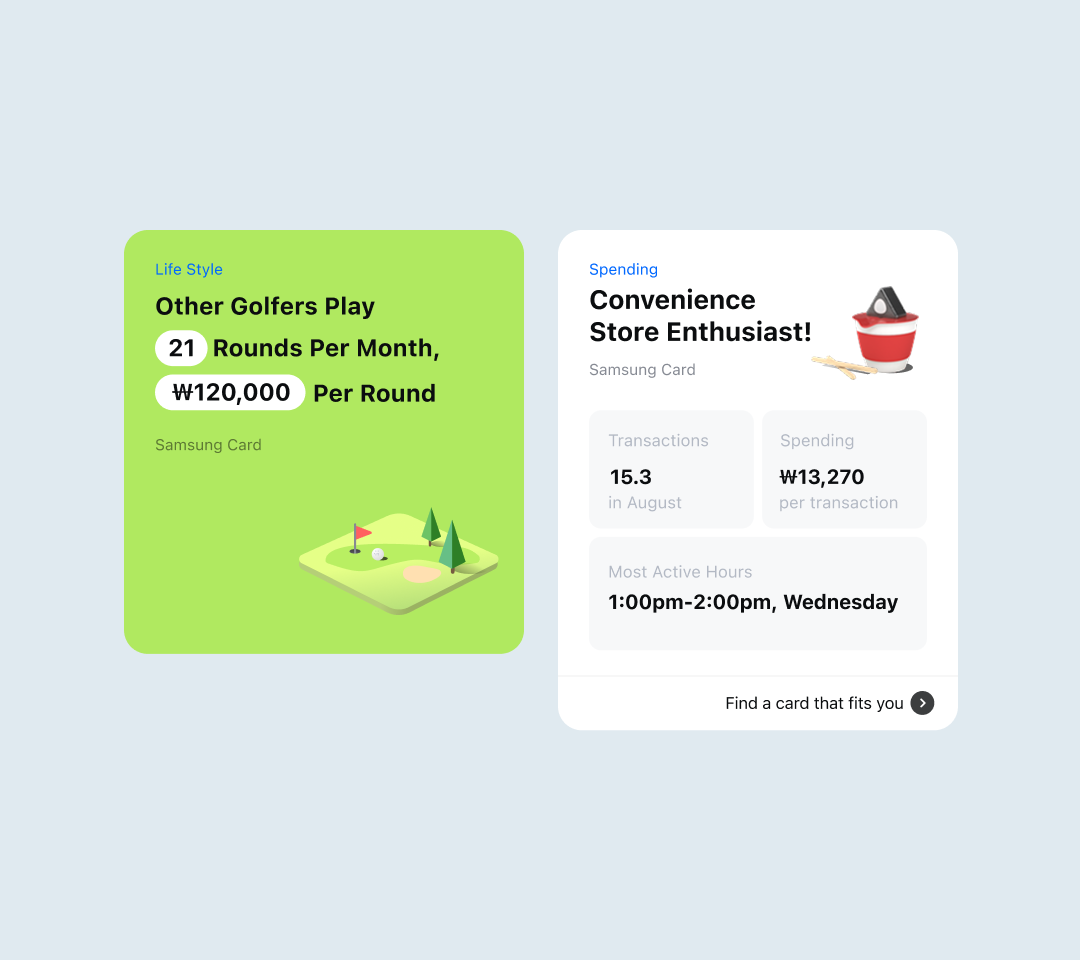
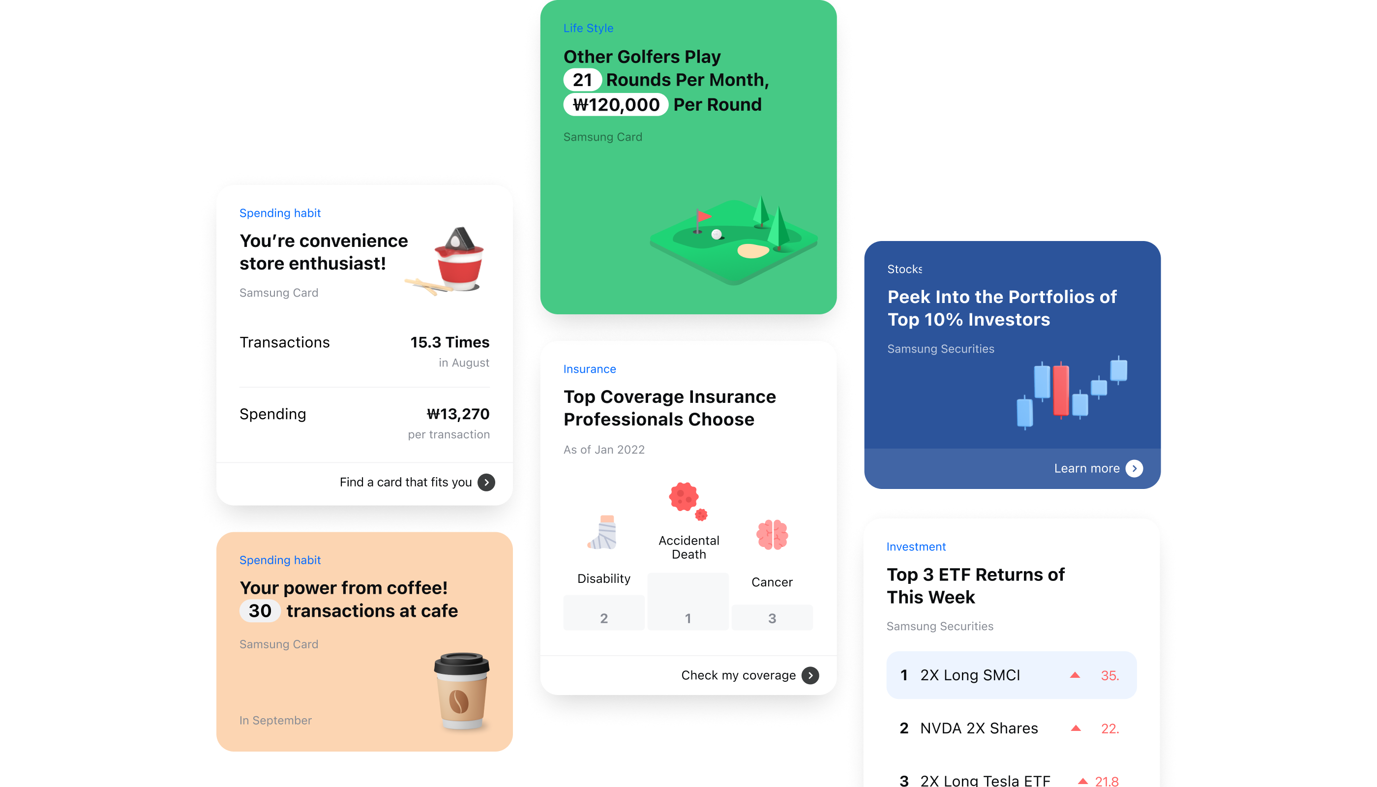
2. Insignts Card
Personal data insights cards built from the user's own transaction and real data — Not just numbers, but a way to understand user's own financial habits and discover products they might actually need.
Make it Understandable & Simple
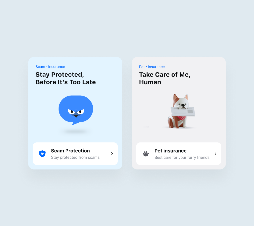
1. Intriguing Financial Products
We designed the product experience using everyday language and relatable scenarios, connecting each product to moments users actually recognize from their daily lives. The goal was to make products feel intriguing enough to explore.
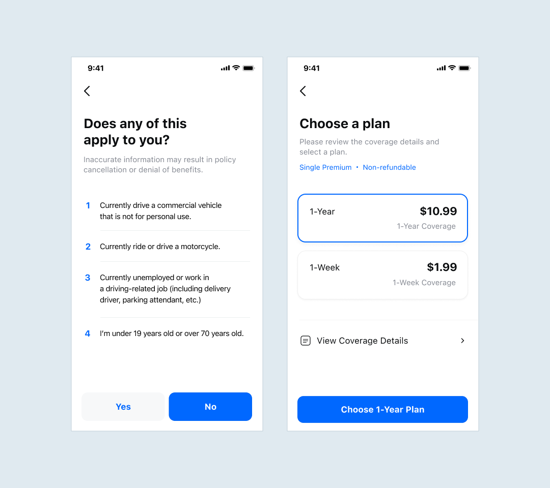
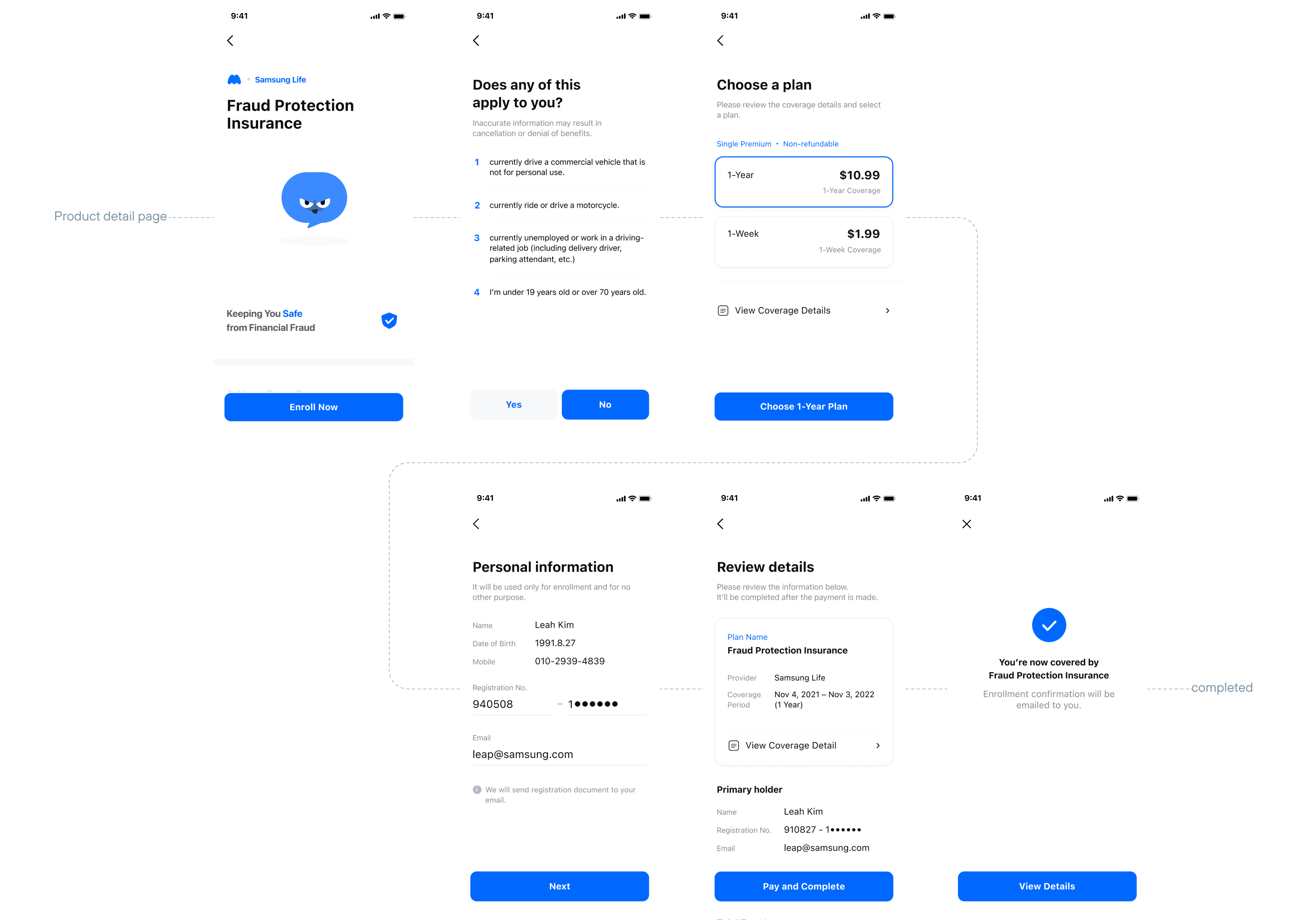
2. Easy Signup Flow
Also simplified the product signup flow by reducing it to the minimum necessary steps, breaking decisions into focused one-thing-at-a-time, and rewriting complex terms in easy words from user’s perspective — so users could complete the process quickly without hassle.
Final Design
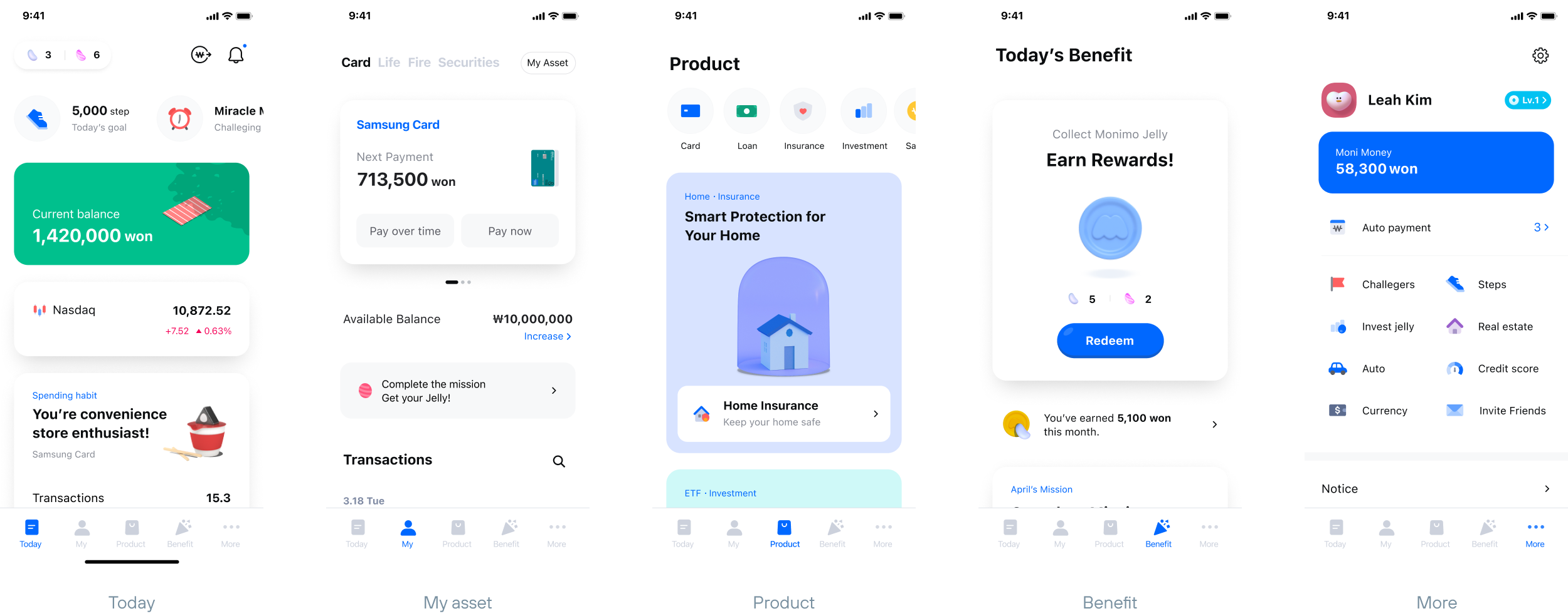
5-Main Tab
Final Monimo is structured around five main tabs — Today, My Asset, Product, Benefit, and More.
Feature 1
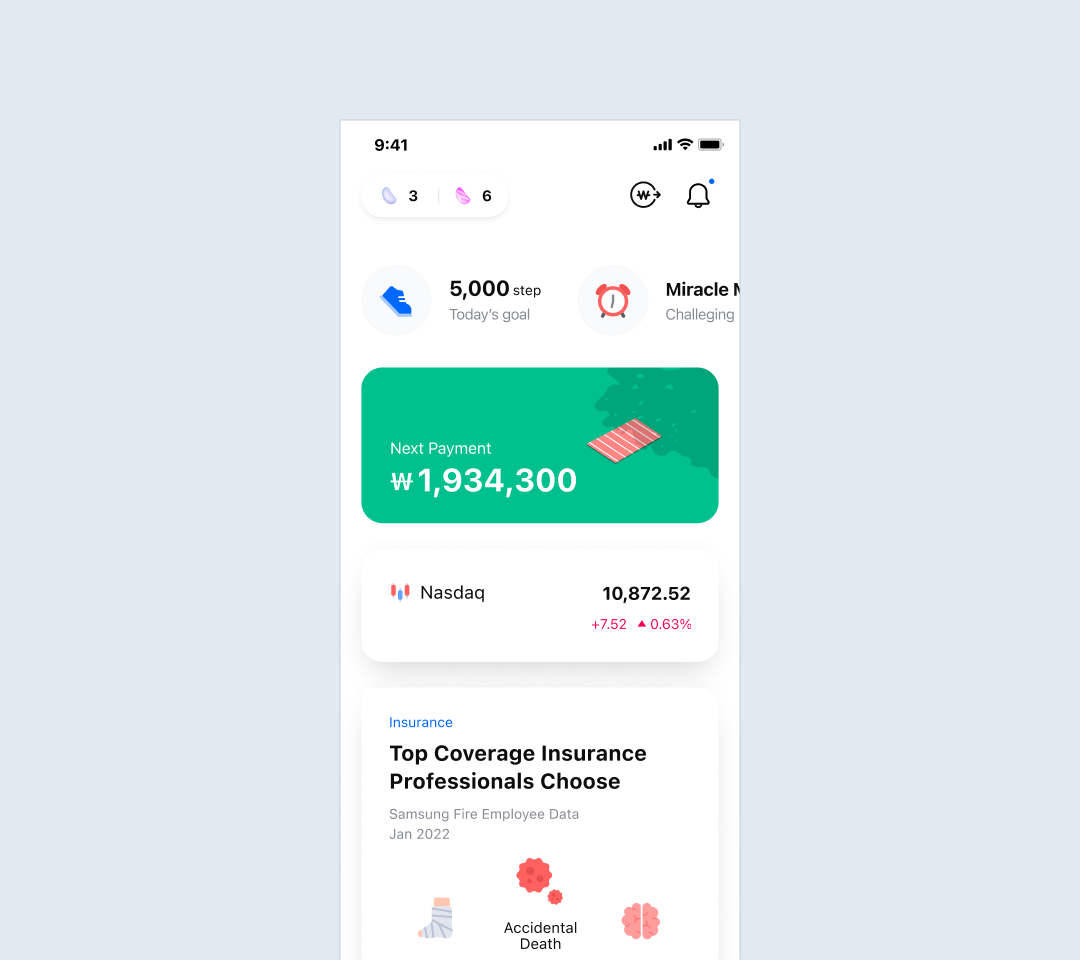
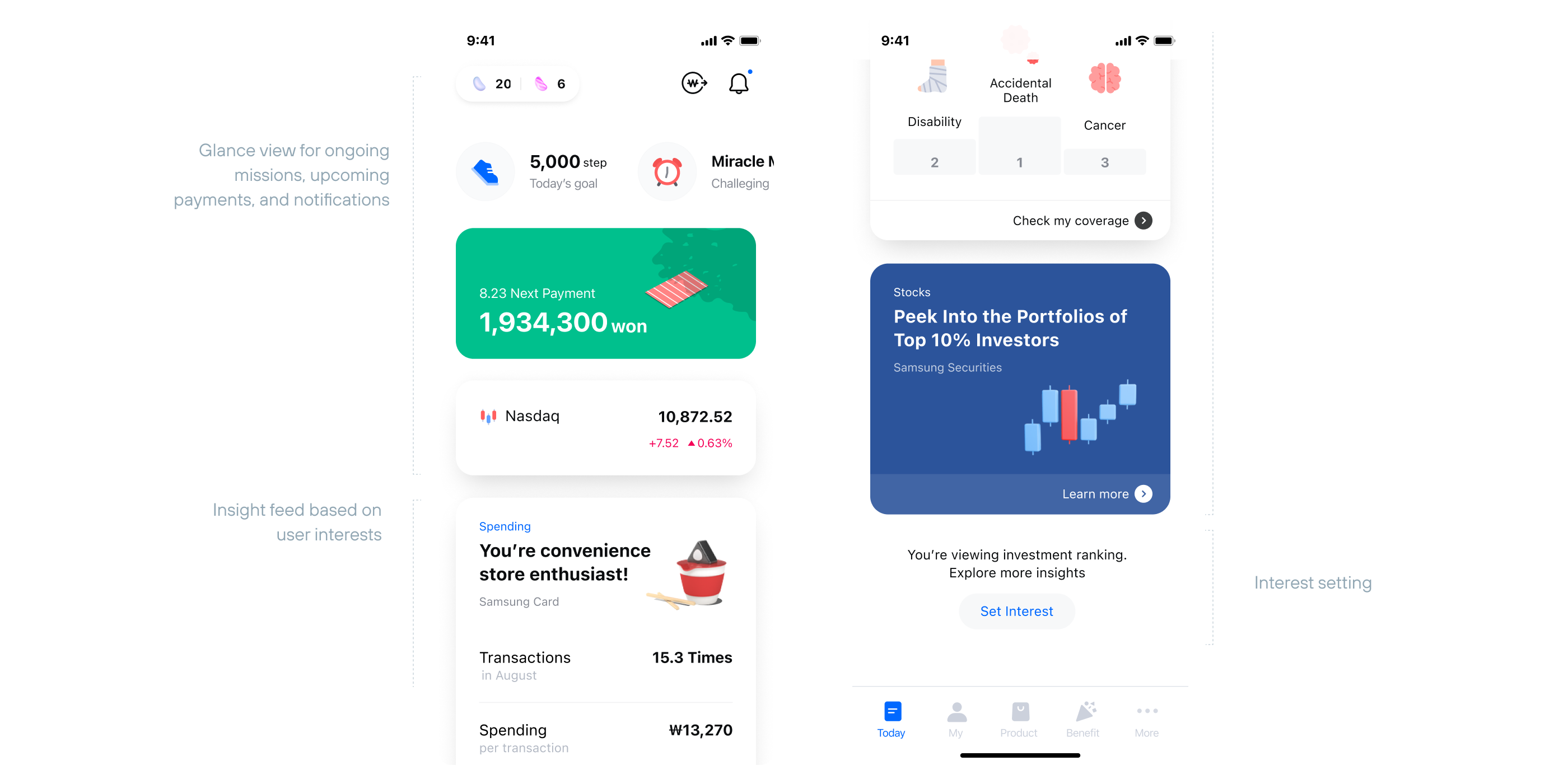
Today Feed
Today feed serves as the main screen — giving users an at-a-glance view of their active events and upcoming payments, followed by daily financial insights based on user’s interest and datas.
Feature 2
Insight Card
Each card delivers a single insight from various sources, user’s own spending data, statistics data from Samsung's financial network, and trending financial content.
Feature 3
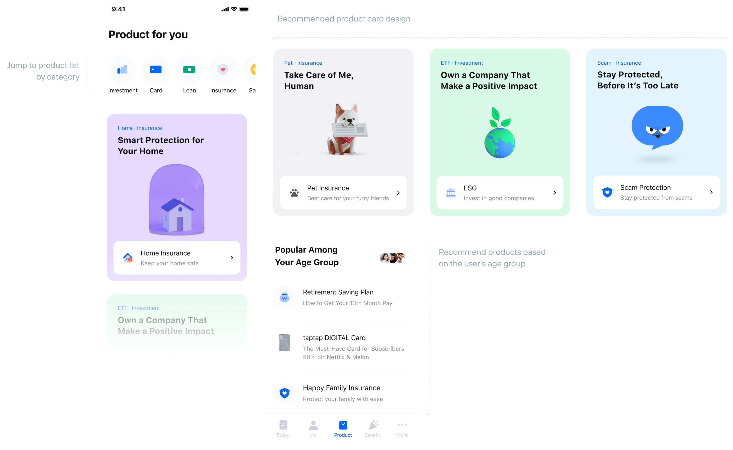
Product Main
The product page is structured into two sections: curated cards with engaging headlines, and personalized recommendations based on the user’s age group—making unfamiliar financial products feel more approachable and worth exploring.
Feature 4
Product Sign-up
The signup flow is reduced to the minimum necessary steps. Each screen focuses on one decision at a time, so users can complete the process quickly and without hassle.
Takeaway & Outcome
Monimo reached 5M+ downloads within 4 months of launch — a result that validated the core belief that finance could be made more engaging and approachable for everyday users. Building a financial platform at this scale taught me that the hardest design problems aren't visual — they're strategic. Deciding what to show, in what order, and how to make it feel personally relevant required as much systems thinking as design craft.
Press & Media