Aron Signs MOU with Kakao Mobility to Expand EV Charging Convenience
ONDA, Building MVP App for
EV Charging Delivery
Aron is a start-up that is preparing mobile EV charging business in very early stage. I helped Aron as a product designer to create MVP apps and web for a limited beta release and funding. Also built a scalable design library and illustration assets to support quick adaptation to various changes as ONDA continues to expand.
Focused on the Key Problems
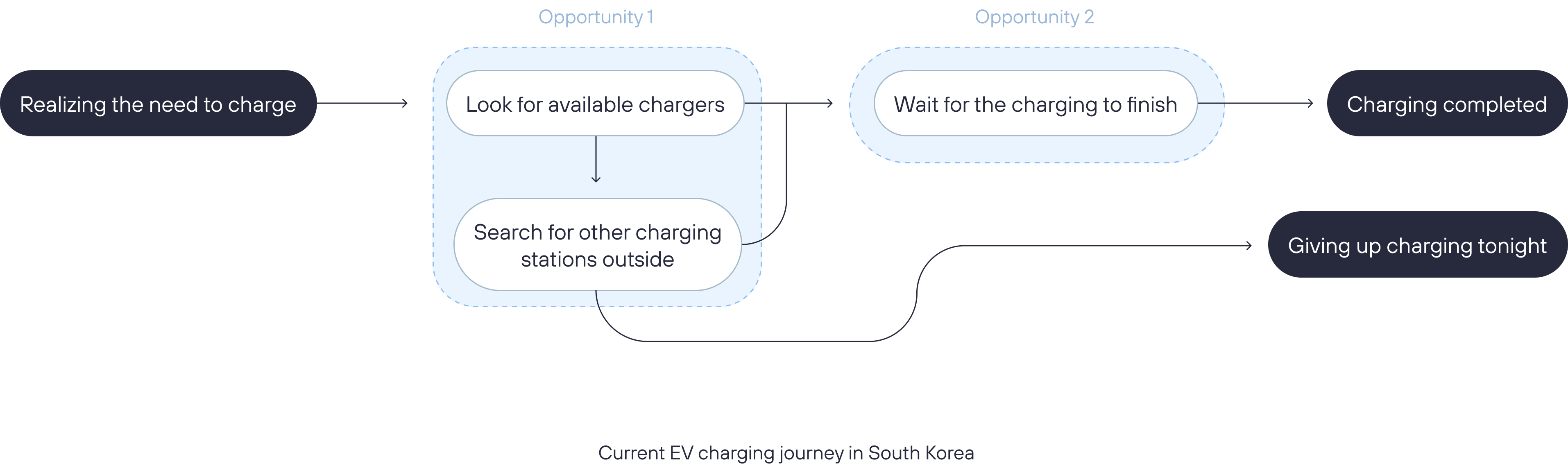
To build an effective MVP, first needed to understand the core value the service could deliver to users and identify the key pain points in the EV charging experience. Through discussions with Aaron’s team and insights from preliminary user research, we identified two key problems that needed to be addressed.
Key Problems
1. Cumbersome EV Charging Process
EV charging can be inconvenient and time-consuming in Korea, as users need to find an available charger due to limited chargers in apartment living, and wait for it to finish.
2. Uncertainty in a Contactless Service
Because the service operates without face-to-face interaction, users often feel unsure whether their vehicle is actually being charged.
Design Strategy
Minimize Disruptions and Make It Transparent
1. Make Request Process As Easy As Possible.
- Step-by-step request process for first-time users Guides users through the necessary steps to avoid confusion.
- One-page request process for returning users Allows experienced users to request charging quickly without unnecessary steps.
2. Uncertainty in a Contactless Service
- intuitive request experience.
- Offer At-a-glance view of tracking progress after requesting, and while charging.
Simple Structure
Navigation Menu
First, I defined the navigation menu with four essential features below:
- Home (As a main screen for Charging & Progress Tracking)
- User Guide
- History
- My menu

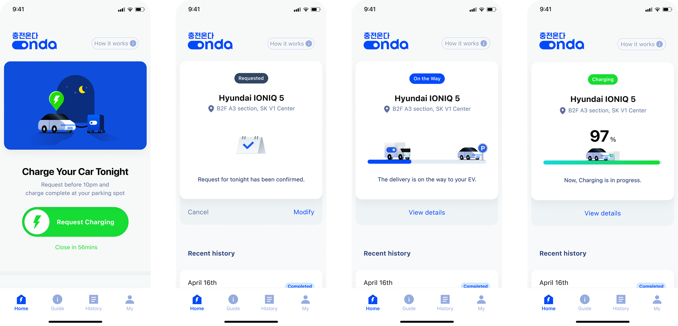
Solution 1: Request to Track
From a Charging Request to Tracking Progress, Without Navigating Away
The main screen is designed to keep users focused on what matters, so that users can immediately focus on the main feature—charging requests—as soon as they open the app. After submitting a charging request, users can track the entire process on the same screen. This allows users to understand the status of their charging at a glance without needing to navigate to other pages.
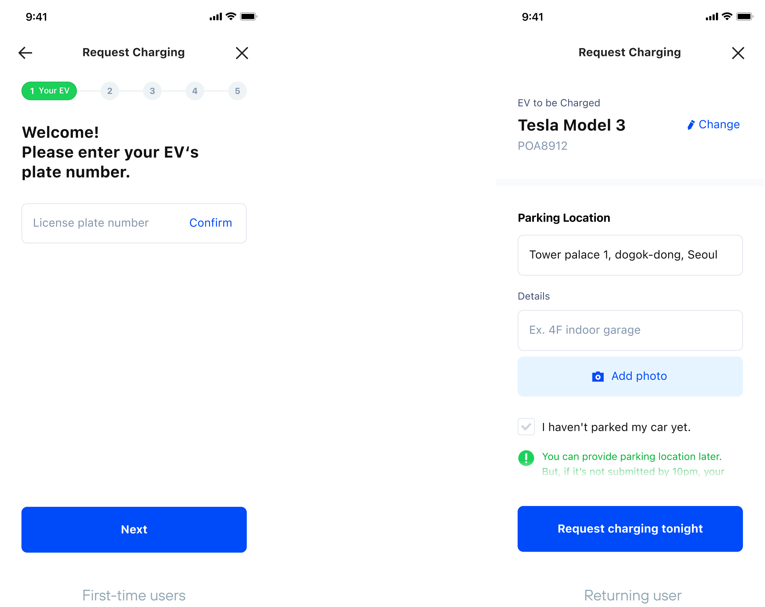
Solution 2: Request Process
Step-by-Step Guide for First-time Users,
Single Page Form for Returning Users
For first-time users with no prior experience, I designed a step-by-step application process that provides clearer guidance through each stage. For returning users with existing information on file, the process is streamlined into a single page — where only dynamic details such as parking location need to be confirmed or entered, allowing for a faster and more efficient experience.
Outcome
After the project was completed, Aron successfully secured seed funding in 2023.
Although I joined as a freelance designer supporting the early stages of product design, contributing to a funding phase at such a formative point in the company's journey was genuinely rewarding.
One regret I carry from this project is not having had the opportunity to validate and refine the experience through actual beta testing. Observing how real users interacted with the product — and iterating on what that feedback surfaced — would have been invaluable. Later, Aaron pivoted the business in a different direction through the investment process. But still, ONDA gave me one of the clearest lessons: the most important thing is to focus on the most fundamental user problem. When a team is aligned on what matters most, it becomes possible to move quickly, make confident decisions, and test ideas before they grow too complex to change. That clarity of focus is something I now bring to every early-stage project I work on.